Before the 3D financial products, the design systems, and the agentic workflows, the first app I ever shipped to the App Store was the Viz Profanisaurus. A searchable dictionary of British filth, licensed from the comic, published by Dennis. It was covered, rather earnestly, by InPublishing.
I had just joined the Dennis Media Factory, Dennis Publishing's newly formed collective of content and tech nerds tasked with monetising the company's back catalogue on the App Store. The brief: turn Roger's Profanisaurus, Viz magazine's legendary thesaurus of rude words, into a native iOS app. Full-text search, daily word, favourites, share-to-text. The whole kit.
It was, in hindsight, the best possible first brief. A brand with enormous personality that could not be watered down, a content set that demanded careful information design (hundreds of definitions, cross-references, synonyms), and a platform that was still young enough that almost nothing was a solved pattern.
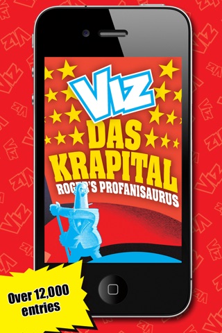
01 / Home
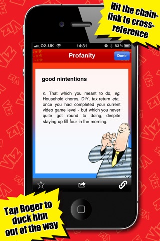
02 / Definition
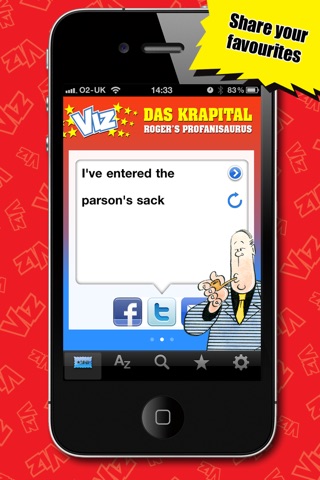
03 / Word of the day
You don't read a thesaurus of filth. You fall into it.
A few things I learned that I still use every week:
Tone is a design constraint. You cannot design a Viz app in a generic iOS chrome. The typography, the colour, the haptics, the empty states, every micro-decision carries the voice of the brand or quietly kills it. The same rule holds whether the product is a comic or a battery storage platform.
Content is the interface. The Profanisaurus is 90% words. The job was to get out of their way while still feeling like a thing you wanted to open. The best UI I ever shipped is usually the least visible.
Ship something you can point at. It sold in the App Store, got reviewed in the national press, and was still on people's phones years later. The lesson was not the feature set. The lesson was that shipping a real thing, to real users, with a real brand, is a different order of difficulty than the portfolio pieces I'd been making up until then.
Fifteen years on I am shipping 3D financial product surfaces with a multi-agent design system behind them. The brief is different. The craft is the same. Decide what the thing wants to say. Get out of the way. Ship it.
Also, if you ever need a synonym for "hangover" that would get me cancelled to write here, there is an app for that.